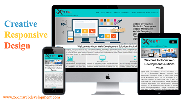
Xoom Web Development Solutions Pvt.Ltd.
- HOME
- ABOUT
- SERVICES
-
- WEBSITE DESIGNING
- Responsive Web design
- PSD to HTML
- PSD to Responsive HTML
- HTML to Responsive designing
-
- WEBSITE DEVELOPMENT
- Zend Framework
- Smarty
- CMS development
- Wordpress
-
- MOBILE APP DEVELOPMENT
- Android application
- IOS Application
- Black Berry Application
- Window Phone Application
- Phone Gap
-
- E-COMMERCE SOLUTION
- Custom e-Commerce
- Magento
- Woo-Commerce
- Zen Cart
-
- WEBSITE MAINTENANCE
- Maintenance Packages
-
- PORTFOLIO
- PRODUCTS
- TESTIMONIALS
- CAREERS
- TEMPLATES
- TECHNOLOGY
- BLOGS
- CONTACT US